-
Architects: bob-architektur
- Area: 11500 m²
- Year: 2016
-
Photographs:Conné van d' Grachten, Olaf Rohl, Espendiller + Gnegel
-
Manufacturers: Saint-Gobain, ABC Klinkergruppe
-
Lead Architects: Robert Wetzels, Jost Dewald, Thomas Ellinghaus, Kerstin Lindscheid, Julian Puchmüller, Karen Höfer, Ulla Bleck, Daniele Aulenta, Paula Catalan Gasulla, Tae Heung Lee, Charlotte Streuber with jbbug landscape architects

Text description provided by the architects. Coming from the Kennedy bridge you reach the peak of the plot with the town hall square, a green space with high quality tree stock, but also strong visual and audible traffic load borders in the back.

The further development was the formation of character of the place through the working out of existing but hidden qualities to promote a clear identity of the place and its design basis. Existing rooms to be taken and differentiated visual links and paths cleared and created space edges.

This intention forms a three building ensemble, which vary in size and form, shape and utility, but they all belong to the atmospheric concep of urban live which is created.

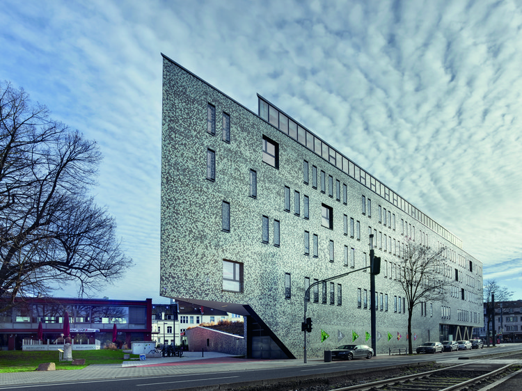
The open spaces continue to flow around the new building and are not constrained by this. These are extended by a green inclined plane, which now unite the buildings with the greem space parts and brings them in an interesting relationship. This fluid level is of central importance. In part, provided with slope and slopes, they will be expanded and pushed along the towering building structure A over the base, to its edge. There it ends and forms a terrace, the new "City Balcony".


From here you can look over the Konrad-Adenauer-Plaza across the Kennedy Bridge. In this flat surface leads from the foot of the pedestal a large staircase. So this area is the interface between green space and room space. It contains various proportions in both green and stone surfaces.

The "City Balkony", next to a restaurant with views of the Kennedy Bridge, is an attractive feature for both the visitors as well as an eye-catcher for the Kennedy Bridge, is the central point of the re-arranged place.

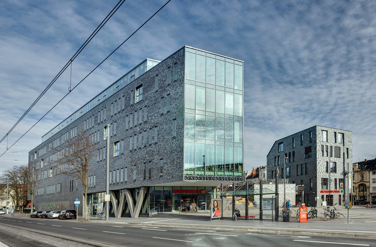
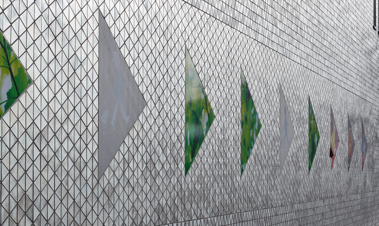
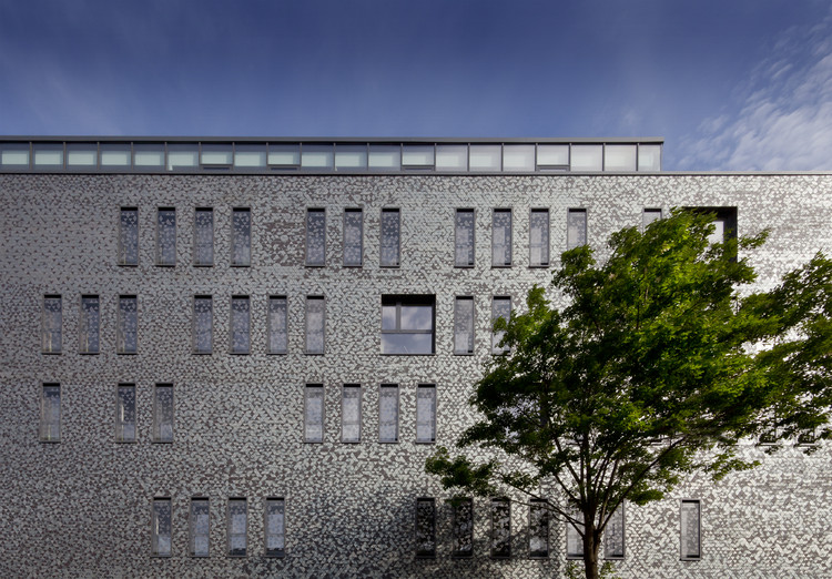
For the facades a silver brick was especially designed. It developes the existing facade and still seem a relationship to the environment. This particular brick is used on the entire area in component A, component B and the parking entrance. Overall 36500 bricks were used for this facades.Windows are installed flush, in some areas with a screen print of the triangular structure, into the building. On the ground floor to the supermarket, glass facades are created from a post and beam construction. Aligned to the Konrad-Adenauer-Platz, overlooking the Kennedy bridge, a glass facade is revalued by a screen printing and so it enhanced the entrance to city of Bonn. This special feature of the facade design is intended to support the specificity of the place and re-emphasize.

As a counterpart across is the component B, which is also planned as a medical center and is seen as a further important point of orientation. Here is also the same silvery brick facade planned as a counterpart to structure A.

Together with component A, the second largest building B forms a kind of gate, which invites the arriving passengers to pass through to get to know the new location.
About this new square design and a pavilion component C, which contains a restaurant, constituted another place of public interest, which is now also directly connected to the Konrad-Adenauer-Platz.

Thus an urban "address" of the Beueler city center is formed and furthermoreb a high quality open space was created.


